
11. Mobile SEO for E-commerce
The whole world is going mobile. So should your e-commerce website. Mobile optimization is something you should focus on with your e-commerce to make the most out of your performance. The number of customers buying from their phones is growing gradually. Even though they mostly use it for browsing, a significant rise in the number of purchases is also noticed.
One of the ways to address the issue of a mobile-friendly site was to have a mobile version of the website. This means that the desktop version would be a primary asset, while the mobile version would be loaded for the mobile users. This practice is no longer recommended for two reasons. Firstly, it gives precedence to the desktop version. However, the search engines now consider mobile-friendliness as one of the most important factors for ranking, and actually, give priority to the mobile-friendly websites in the search results. Secondly, having this separate mobile version can somewhat limit the user experience, because the site might not be fully recreated for mobile.
Instead of this solution, there are different strategies to optimize a website for mobile devices.
Have a mobile-friendly configuration
Nowadays, when designing an e-commerce website, or any website for that matter, you need to use a responsive design. What this means is that you will be creating one website. Still, this site will automatically adjust regardless of the type of device you use to access it. So a responsive design resizes to provide a mobile-friendly experience. There is no need to zoom in to see the text because the content will be adapted to the small screen.
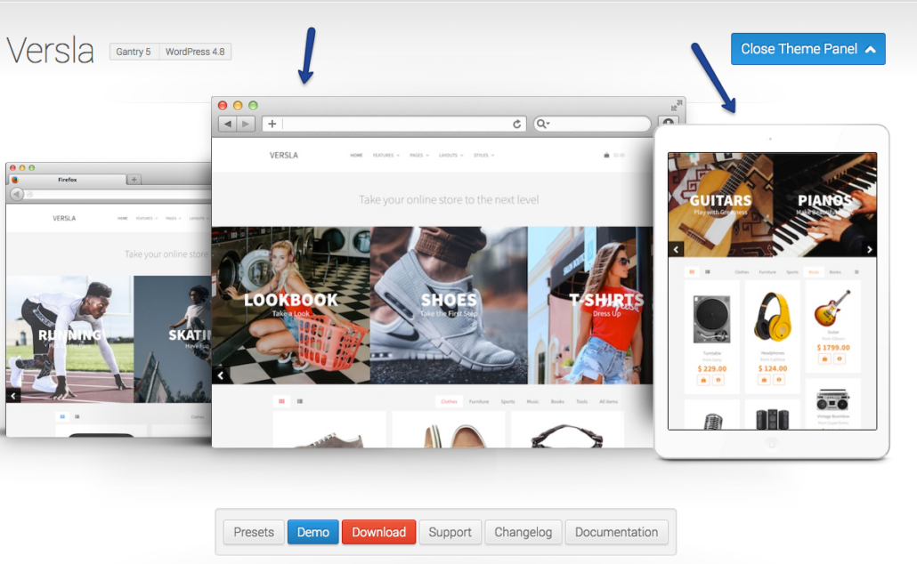
Image: http://www.rockettheme.com/wordpress/themes/versla
Increase site speed
A user accessing your website via a mobile device often has a slower internet connection than the desktop users because 3G network takes more to load content. This means that site speed is even more important concerning mobile users. Browsing and buying online through a mobile device is more “on-the-go” action, and it is expected to be done rather quickly. Therefore, your website needs to load fast to provide good user experience and to keep the users on track until they have eventually completed the purchase.
Try to optimize the site speed using these practices:
- Reduce the number of redirects
- Use tools such as PageSpeed Insights to detect issues that reduce the speed of the mobile site
- Optimize images
Video format
Mobile devices have certain limitations when it comes to how they access and present content of the internet, and flash videos are part of these limitations. Most mobile devices will not support this format. Not only does this lead to a poor user experience, but it also affects sales negatively.
Having in mind that videos are a prevalent type of content and can increase the performance of your website, you should not avoid using them. To fix the issue, use HTML5 video instead. It will ensure that the video is played correctly on mobile devices, thus not harming the mobile user experience.
Design with mobile users in mind
When you are creating a mobile-friendly website, have mobile users in mind and how they interact with the site. Make options tappable, not clickable. Mobile users tap with their fingers which are less precise than a mouse cursor, which means that the buttons should be bigger on a mobile website to make them more responsive.
It is also helpful to have the most important things centrally located. This ensures the highest level of visibility, and this is particularly important when it comes to CTA buttons.

HubSpot mobile homepage
Image: https://www.hubspot.com/
The less they need to scroll to find the button, the more likely they are to tap on it. Therefore, the most important options should be at the beginning of the page, to make them visible as soon as the user gets to the page, before scrolling down to see the rest of the content.
Based on the current trends and where they are taking us, it is expected that we will soon witness the rise of mobile-first websites. This means that in the future, we will be designing websites for mobile first, and then we will adapt them to a desktop view. It is only natural to expect this, as the number of mobile users is constantly on the rise.
For e-commerce businesses, it means that mobile optimization, as well as overall mobile strategy including promotion, content creation, and mobile website analytics, is going to become an essential part of e-commerce SEO.