
A landing page is an integral part of a marketing campaign nowadays. Regardless of the distribution channels used, or the type of campaign that is running, a landing page becomes a bridge that connects your business on the one side with the internet users on the other end.

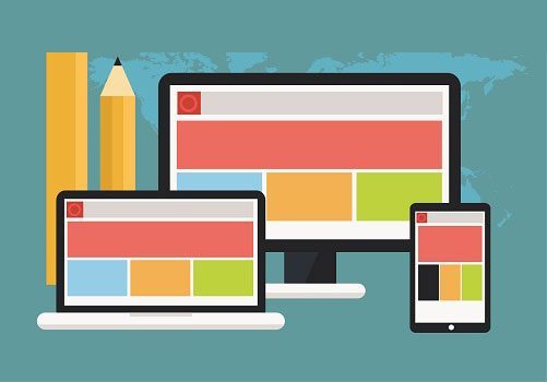
 As a part of online marketing, the design of a landing page is a segment that can have a tremendous impact on your efforts. The landing page can determine the success of your campaign. This is why its design has to be one of the main things you should consider when planning such campaign. To increase effectiveness, you need to think about all of the aspects that affect its performance, including an engaging presentation, user experience, and mobile optimization.
Image source: Unsplash
What is a landing page?
A landing page is a web page on which users “land” when visiting your website. Basically, it’s the entry page, the first one users see once they click on the link that points to your website. In this sense, any page on your site and blog can become a landing page. However, from a marketing point of view, a landing page is the term usually associated with a particular kind of page that is created to advertise something purposely. In this case, there won’t be a lot of landing pages, but instead, you’ll have one or a couple of those that will help you with achieving your goals. The idea is to bring traffic to these landing pages, and then be able to complete a conversion through this page. The ultimate goal of such page is to convert the visitors, and what is going to help you with this is an effectively designed landing page. To analyze what makes a landing page effective, let’s divide the elements into two groups – presentation and optimization.Presentation
The primary purpose of the landing page is to create and present content to achieve a particular goal. The crucial thing here is the presentation. The way you introduce the content has so much effect on how visitors will perceive this content. In fact, there will be quite a few visitors who will land on the page and just have a quick look. You’ll have a couple of seconds to convince them to stay, or they’ll leave without a trace. Since your goal is for them to stay (and eventually complete the desired action), try to present the content in such a way that it:- Sparks interest
- Looks appealing
- Is engaging
- Is organized well
- Highlights the most important things
- Provides enough information
Headline
A headline is placed at the top of the page, and it’s the first thing visitors will see. Compared to the rest of the text on the page, the headline is bigger and more prominent (different font, bold or italic, etc.). This is the initial step that will either grab the attention or lose it. Therefore, make it interesting and engaging. Try to come up with the title that will convince visitors to keep reading. One way to do so is by highlighting goals the visitors will achieve as a motivation for them to find out more. For example, with a title “Build influence on social media to increase sales” you’re directly targeting those who want to increase sales with social media. This is the goal they want to achieve, so chances are they are willing to learn more about your offer. If you want more tips on landing page headlines, as well as some examples of great and not so great headlines, here’s an interesting article: 3 Essential Ingredients of Landing Page Headlines That Convert.Text
The purpose of the text on the landing page is to explain the offer and convert the visitors. You’ll have to do this in as much text as you need it. You should not be too elaborate, but make sure you clearly highlight all the aspects of the offer and use the text that is convincing, encouraging, and inspiring. This content is what’s going to influence the decision-making process. Think about it this way. The user clicks on the headline, and he’s interested in learning more. Therefore, he continues reading the text to see if this is something worthy. When writing the text of the landing page, you should:- Stay focused and be relevant to the topic
- Use formatting options such as bullets to make the text more readable
- Explain the benefits of the offer
- Be convincing and persuasive
- Use “You” to make the content more personal and relatable
- Add urgency using phrases like “Only x days left” or “Limited-time offer”
- Insert action verbs to encourage action (save, get, click, claim, etc.)
CTA
A CTA (call-to-action) is the button that should encourage clicks. The landing page has a specific goal such as claiming the offer, buying a product, etc. Naturally, you should encourage the users to click on this button and thus complete the desired action, i.e. conversion. The first thing you need to consider with CTA is the design. This button should be big enough for users not to miss it. It should be incorporated well into the landing page (color, font, size, etc.). You will also need to think about where to place the CTA. Ideally, it should be somewhere at the top of the page, so that it’s clearly visible and accessible. When it comes to text on the CTA button, it should be short but engaging. It should contain an action verb, such as download, save, get, buy, click, etc. It basically says what you want users to do (download an ebook, save PDF, get a coupon, buy [the product name], etc.). If you would like to discover inspiring ideas for a CTA, here’s a collection of interesting examples and why they work: 31 Call-to-Action Examples You Can’t Help But Click.Visual elements
In general, visual elements increase the level of engagement and interest by far, so it’s only fair to take advantage of those on landing pages. Use images and videos to show the product or software you’re promoting. Create an engaging graphic that will inspire people to proceed and learn more. Think carefully about positioning the visual element. You do want to make it prominent and visible, but still, the title and the CTA should have priority when designing the landing page. It’s worth thinking about page layout in general. You will have more flexibility with placing visual content on the desktop version of the page because of the wider screen, than when designing the mobile landing page.Optimization
The second part of the landing page design is optimization. This means editing and improving all of the aspects that affect the performance of the page. Optimization is done immediately after you create a first draft of the page, but it’s the process you should repeat later on as well. Once the landing page is live, and once you start seeing actual visits, you’ll get much more detailed data about the performance of the page. This gives you the basis for making necessary adjustments to gain even better performance.Relevancy
The entire landing page should be relevant to the actual topic and offer you want to promote through this landing page. This includes the title, the text, the visual elements, the CTA, as well as other segments you might use, such as a form. Moreover, the entire page design should be inspired by the goal of the campaign and the overall company vision. This should be something that users can easily relate to your brand, increasing credibility and trust in your offer.Consistency
Being consistent is very important when trying to create and differentiate your brand on the market. Consistency should be a part of your overall internet marketing strategy. Therefore, when you design a landing page, think about the following. The landing page you’re trying to create has specific goals. It’s usually a part of a marketing campaign, regardless if that campaign is promoted through email marketing, search engine ads, etc. A landing page is a crucial part of your leads or sales funnel, in the online strategy you’re using to promote your brand. Make sure you optimize the page so that it’s consistent with the rest of your marketing efforts and that it follows your general online marketing vision.Responsiveness
It’s common knowledge that mobile accessibility has such a tremendous role in online marketing nowadays. This is the reason why a step in your landing page optimization should be making sure the page is responsive on all devices. Targeting users on all devices is the only way you can maximize the reach and make sure your landing page is visible to everyone. Consider editing as a part of the process. Make sure you edit based on the feedback you get about the landing page performance. The feedback can be provided by the users themselves, in the form of a poll. Alternatively, you could come to conclusions using page analytics. Another way to benchmark the performance of the landing page, and thus discover ways to make it more efficient is A/B testing. Compare the relevant page elements through this type of testing and explore ways how altering those affect page performance.Three landing page examples and what makes them effective
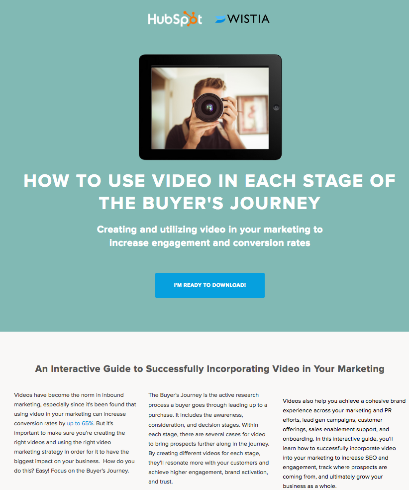
As industry leaders, it’s only natural for HubSpot to set standards when it comes to landing page design. All of the elements of an effective landing page are there. The title is quite straightforward, focused exactly on the topic. The short description highlights the primary goals which are also the motives for the user to claim the offer. As you scroll down the page, there is a description of the offer, with bullets, FAQs and a sneak peek. This provides a detailed explanation about the offer, but all of the most important parts of the landing page, which actually encourage conversions are at the top of the page. The only thing missing from this page is a link to HubSpot blog or homepage, or a search button. Even though such link or button is optional, and does not affect the design of the page, it’s sometimes helpful. Online users can come to your website from various sources, and not all of them will have previous knowledge about your company or your brand. If a user were to arrive at this page from a social media share, and he hasn’t heard of the company before, he might want to learn more about the company, before claiming the offer.
Image source: HubSpot
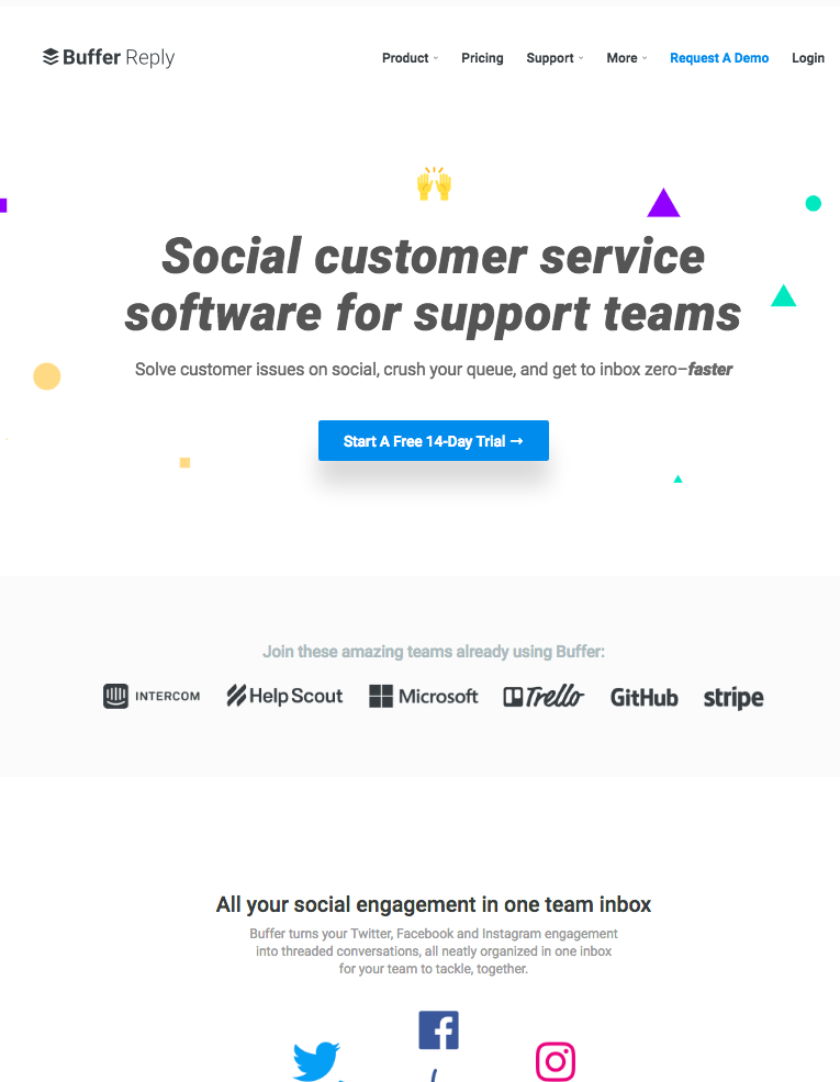
Here’s another example of a nicely designed landing page. Again, the title and the short description are relevant, concise but explanatory. There are two CTAs. The first is the more prominent one due to the contrasting color (blue button and white background). The navigation menu is present at the top of the page. Once you scroll down, you can see other details about the software such as featured clients. The most important features are highlighted with headings, short description, and images. The blue button for a free trial appears twice more, once in the middle of the page and again in the end. This is very handy for the users who are exploring the landing page, encouraging them to click. If your page is going to be long and users will have to scroll down, having the same CTA in several places can be quite helpful for increasing conversions.
Image Source: Buffer
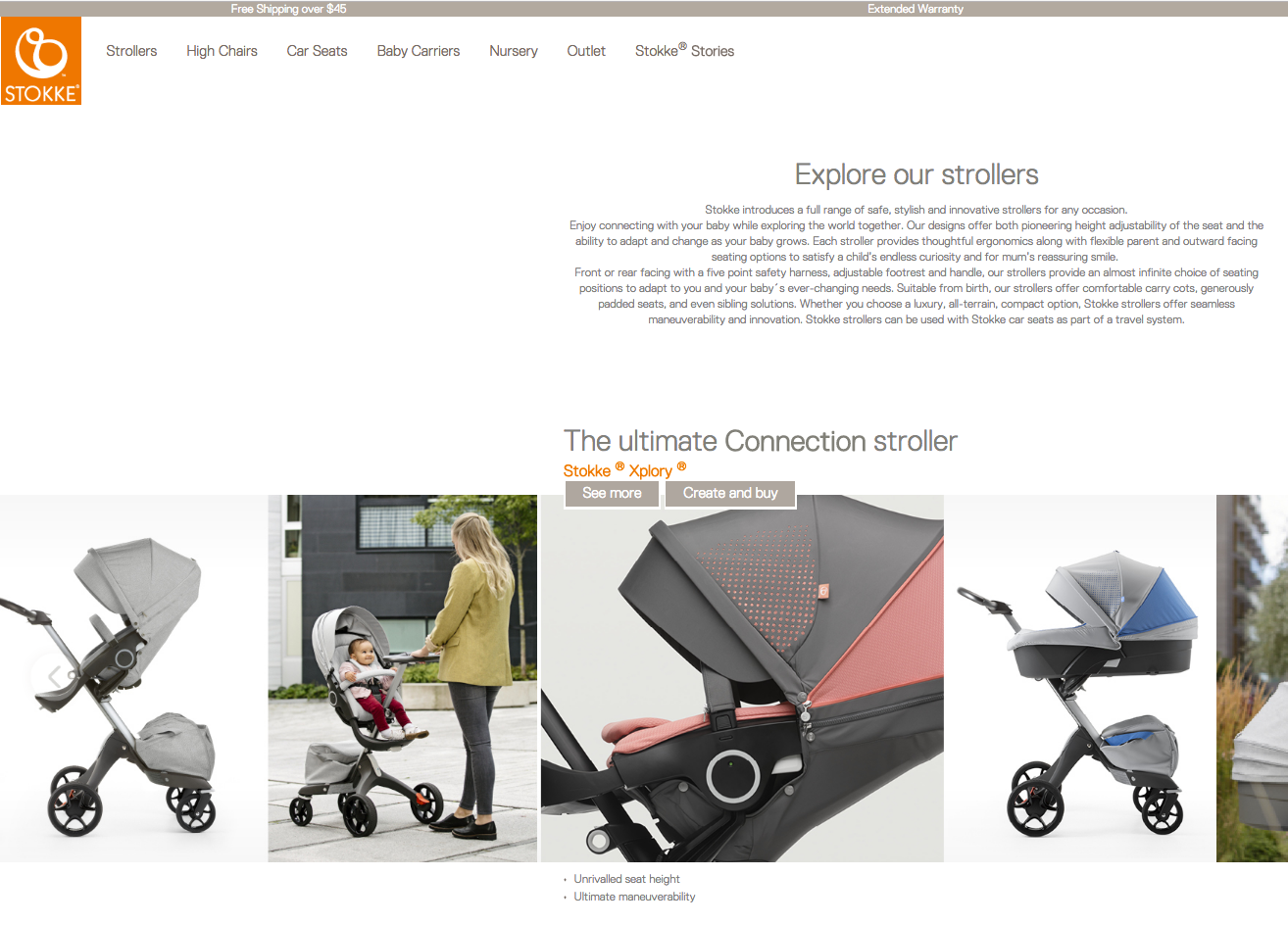
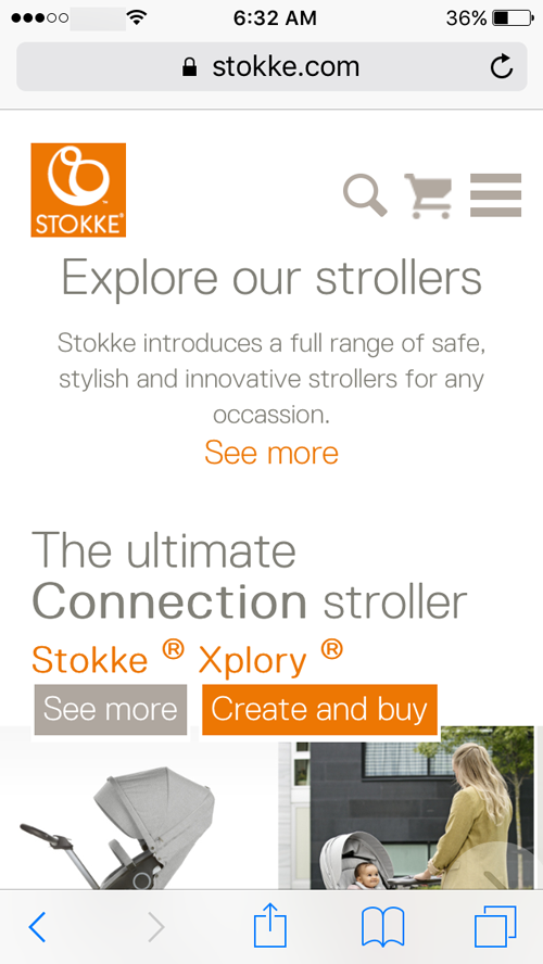
Since the Stokke landing page is designed to sell products, product images take a significant part of the page. You can slide through the images to see more of them. Unlike other landing pages, the description is a bit longer. The primary concern is how this page looks on mobile devices. Both the image slides and a long description could potentially harm the performance of such page on mobile devices.
Image source: Stokke
However, this isn’t the case here. The mobile version of the page shows a one-sentence-long description with a “See more” button that extends to the full description. The images load quickly, and the user experience is in no way disrupted.
As a part of online marketing, the design of a landing page is a segment that can have a tremendous impact on your efforts. The landing page can determine the success of your campaign. This is why its design has to be one of the main things you should consider when planning such campaign. To increase effectiveness, you need to think about all of the aspects that affect its performance, including an engaging presentation, user experience, and mobile optimization.